Superbuns - hand lettered logo case study
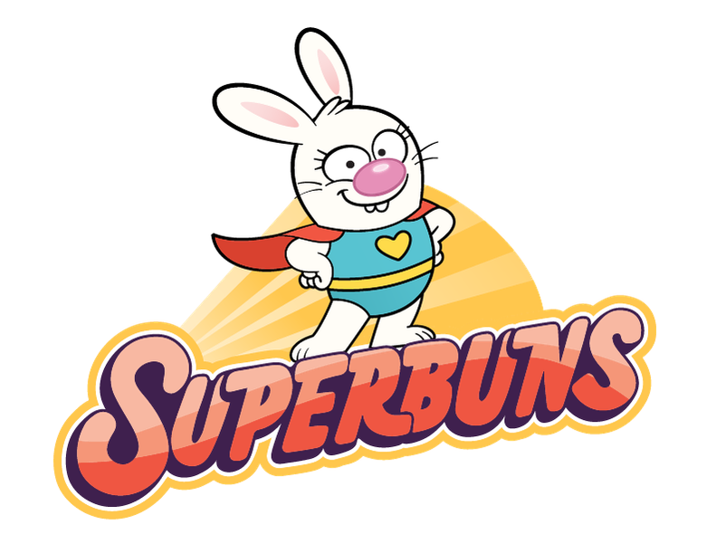
I was approached by Yowza Animation and Diane Kredensor to create a new logo for the property Superbuns which was about to move from picture book to animated series on NBC’s Peacock streaming channel.
In this post I’m sharing behind the scenes sketches and communication with the client. Read along to see how we collaborated to bring this cute logo to life.
COMMUNICATION -
The clients weren’t too familiar with working with a freelance illustrator for logo creation. So I shared an explanation of how logo work, works -
“My show logos are quoted as a flat rate buyout. You have full rights to use them on the show, as well as for any merchandise, promotions - basically, it’s yours and you can use it anywhere you need to. I only reserve the right to use it for self-promotion, after you publish on your end of course.
Because of the value provided (ability to use it anywhere, worldwide, forever) the price is quite high. If this is beyond your budget a way to adjust this price is to limit the usage time period to a year, three years etc. Then if the brand takes off you can extend the time period purchased, because you now know it’s worth the investment. If the brand isn’t doing well and you don’t wish to renew then the rights revert back to me, the artist and can always be purchased again down the road.”
SPECS: The work included in the price
- Research on competitive brand logos, style trends
- Up to 10 sketched ideas - up to 3 rounds of revisions
- Up to 2 linears selected - up to 3 rounds of revisions
- 1 final full colour - 1 minor revision
- High res file delivered
We agreed on a price for a full unlimited buyout and then I got to work sketching. I presented them with some rough sketches and this explanation:
“The first two pages are preschool logos I’ve collected to see what else is out there in the market. The first page is more superhero themed shows, the second is general preschool shows.”
This research allowed me to see what was out there for the market. I looked at colours, shapes of letters, style, lockups. I wanted to create something that would look like it fit in the market, but would also stand out amongst the competition.
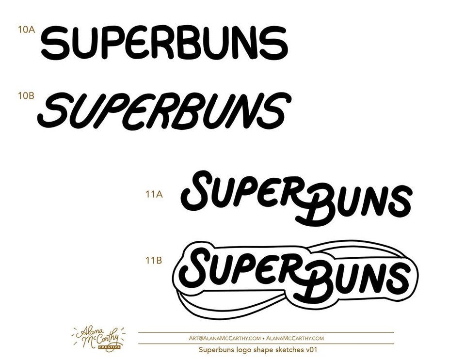
“Here is a PDF of logo concepts. At this stage we’re just looking at the letters and shape of the logo. They will have colour and details added at a later stage. I’ve created a mix of capital lettered logos as well as lower case. Feel free to use the numbers to reference anything you like / don’t like about certain concepts. I’m happy to mix and match for the next round. ”
They selected two concepts and I went on to rough out some vector versions as well as different colour applications. Since the original logo was orange they really wanted to move away from it and the typical bunny=carrot idea. We decided to look to the colours of Superbuns’ costume, and I also made sure the logo worked on the show backgrounds.
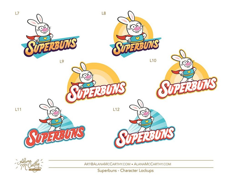
They made their selections and now it was time to add a hero option to the logo, with Superbuns herself.
A few tweaks to the character by the animation team we were ready to go to final. I prepared a bunch of variations - full colour, full colour with character, black and white for dark and light backgrounds. Looking forward to seeing it on the new series! Superbuns - Kindness is her Superpower!
If you’re in the US you can stream episodes of Superbuns on Peacock NBC.
Are you an animation company looking to create a custom hand lettered logo for your show? Reach out to me here and let’s create something awesome!
- Alana McCarthy


